

IRREVERSIBLE/ International Posters


The French and international posters for Irreversible, illustrated by Laurent Lufroy, embody a radical aesthetic.
Laurent Lufroy became a poster artist in the late 1980s when the art of poster design was declining in favor of more standardized promotional formats based on photographs. Nevertheless, the graduate of the École Supérieure des Arts Appliqués in Paris would go on to make a remarkable name for himself by designing posters for Gaspar Noé, Luc Besson, Jane Campion, David Lynch, and Jean-Pierre Jeunet.
A powerful illustrator, Lufroy contributed to the graphic work of Gaspar Noé: Irreversible , Enter the Void, Love, Climax, Lux Aeterna, Vortex… are all sublime visual creations. Distributors of radical auteur films sought him out. Besides Noé, he worked on the promotion of films by Jeunet, Kounen (My Cousin), Gans (Brotherhood of the Wolf, Beauty and the Beast), Dupontel (Bye Bye Morons, See You Up There)…


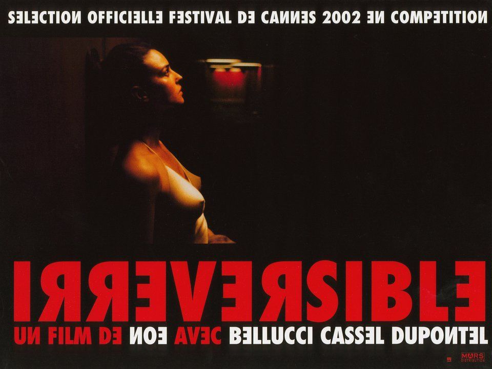
The Irreversible poster features a contrasting palette of red, black and yellow evoking urgency, violence and emotional chaos.
The title “IRREVERSIBLE,” in all caps, massive, often vertically aligned or in a banner, creates a visual impact that cannot be ignored. The typographic hierarchy is minimalist: the title dominates, the credits are secondary, reinforcing the austerity of the visual message. This approach creates a tension between the image (often blurred or a close-up of a face) and the text, at the heart of the graphic experience.
Gaspar Noé considers the credits like a living extension of the poster: same formal aggressiveness, same typographic impact. The inverted design on screen visually reinforces the concept of distorted time, central to the film.
Gaspar Noé, assisted by graphic designer Laurent Lufroy, created an uncompromising typographic design for Irreversible: brutal legibility, formal inversion, and an implacable visual rhythm. The opening credits and the poster are two sides of the same visual coin, preparing the viewer for the narrative intensity. This style contributes significantly to the film's radical and unforgettable identity.
His aim: to make the poster a pure visual warning, uncompromising, devoid of marketing seduction—like a signpost pointing to imminent danger. There's a palpable desire to disarm the viewer even before they enter the theater.
In an interview (Flash Cinéma, 2021), Lufroy confided:
"I tried to convey the idea of a tipping point, of claustrophobia... Noé wanted a poster that wasn't illustrative, but sensory. The red isn't blood red, it's an urban, toxic, organic red."
He also speaks of a deliberate “non-design”: the poster must shock, not seduce.
The poster for Irreversible is not a “communication tool”, it is a graphic warning device:
- It foreshadows the trauma of the film, creates immediate tension, and refuses any concessions.
- Laurent Lufroy's work, while seemingly simple, is based on a radically controlled design: each element is designed to provoke a physical sensation.


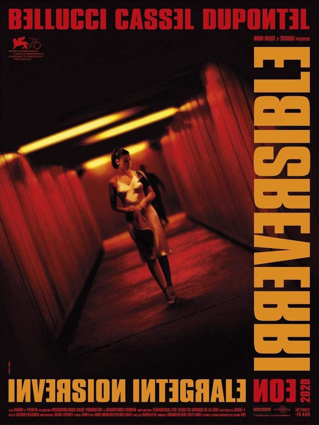
The 2020 poster for Inversion Intégrale is visually almost identical to the original 2002 edition, preserving the aggressive vertical typography and the red-black-gold palette.
The only notable difference is the addition of a label indicating the new edit, without altering the graphic intensity.
This choice reinforces the idea that, for Noé and his graphic team (Laurent Lufroy), the objective is to maintain the radical visual voice of the film, regardless of the narrative structure.