

CULT FILMS... CULT POSTERS !
Gaspar Noé has always placed paramount importance on the image, and this is reflected even in the posters for his films. From Carne (1991) to Vortex (2021), each of his works has been accompanied by visual work as radical as his mise-en-scène.
Several recurring themes emerge: striking compositions characterized by their directness, bold typography often set against black or red backgrounds, and a penchant for shocking iconography. The poster for Irreversible (2002), for example, remains marked by a disturbing simplicity, playing on a contrast of bright and dark colors, mirroring the film itself. The poster for Love (2015), on the other hand, provokes with its sexually explicit aesthetic, embracing a sensual and provocative tone.
Noé also likes to subvert conventions: the poster for Climax (2018) evokes a psychedelic collage where bodies writhe in a frenzied dance, while Vortex (2021) adopts a more restrained and fragmented approach, true to its fragmented and intimate narrative. Even his early films, Carne and I Stand Alone, already displayed this desire for visual brutality: overwhelming typography, close-ups of faces, barely veiled threats.
Over the years, these posters have become collector's items, sought after for their rarity and graphic impact. Some, like those for I Stand Alone or Carne, circulate almost exclusively on the vintage market. Others, like Love or Climax, exist in several more accessible versions, sometimes reinterpreted by contemporary artists.
In short, Gaspar Noé's posters do more than simply announce a film: they already condense the experience. Violent, disturbing, sometimes magnificent, they function as mirrors of his cinema, where the image always precedes the shock.

The beginnings: the raw shock (Carne, I Stand Alone)
In 1991, Carne, a raw and disturbing medium-length film, already established a radical aesthetic. The Japanese poster depicts a stark, almost filthy world where text overwhelms the image. Four years later, I Stand Alone (1998) confirmed this taste for immediate impact: the face of the "butcher," frozen in an expression of rage, is shown in close-up. No graphic subtlety, but a promise of direct confrontation with social and intimate violence. (Click on the photo...)

International recognition: Irreversible (2002)
With Irreversible, Noé gained widespread recognition—and scandalized Cannes. The film's poster contributed to this provocative aura: an incandescent red background, vertical typography that seems to fall like the reversed time of history, and silhouettes lost in shadow. Nothing of the brutality of the images is shown, but everything is suggested. It's a lesson in unsettling minimalism. (Click on the photo...)

Psychedelic trance: Enter the Void (2009)
Seven years later, Enter the Void pushes visual experimentation even further. The poster stands out as a true graphic work of art: saturated neon lettering, fluorescent colors reminiscent of Tokyo signage and the drugs that permeate the narrative. No faces, no bodies, but a chromatic explosion that seems to vibrate of its own accord.
Where Irreversible played on the economy of symbols, Enter the Void embraces excess: a psychedelic and hypnotic universe that already foreshadows the trance of Climax. This poster has become iconic, to the point of being regularly reissued as art screen prints. (Click on the photo...)

Between desire and provocation: Love (2015)
Thirteen years later, Love marked a turning point. This time, the poster opted for explicit shock: a sexually charged kiss, captured in close-up, saturated with warm colors. There was no beating around the bush: the image embraced the pornographic and intimate nature of the film, blurring the lines between art-house and erotic cinema. Here, the poster didn't just accompany the film; it became a manifesto. (Click on the photo...)

The visual explosion: Climax (2018)
For Climax, Noé abandons minimalism in favor of a delirious composition. The film's dancers intertwine in a geometric fresco, like a frozen trance. Garish colors, all-caps typography, and the staging of disjointed bodies: everything points to a collective, feverish, and chaotic experience. The poster perfectly captures the film—a dance that turns into a nightmare. (Click on the photo...)

Lux Æterna: a poster as a warning (2019)
The poster for Lux Æterna immediately announces the radical nature of Gaspar Noé's film. Minimalist and devoid of explanatory images, it rejects the classic codes of promotion, functioning instead as a direct signal to the viewer. The title, marked by the ligature "Æ," evokes an almost sacred dimension, quickly subverted: here, light doesn't illuminate, it assaults.
By showing so little, the poster speaks volumes. It doesn't promise a story, but an intense sensory experience, like a film that questions the excesses of cinema and the power of images. More than just an advertisement, it stands as a declaration of intent. ( Click on the photo... )
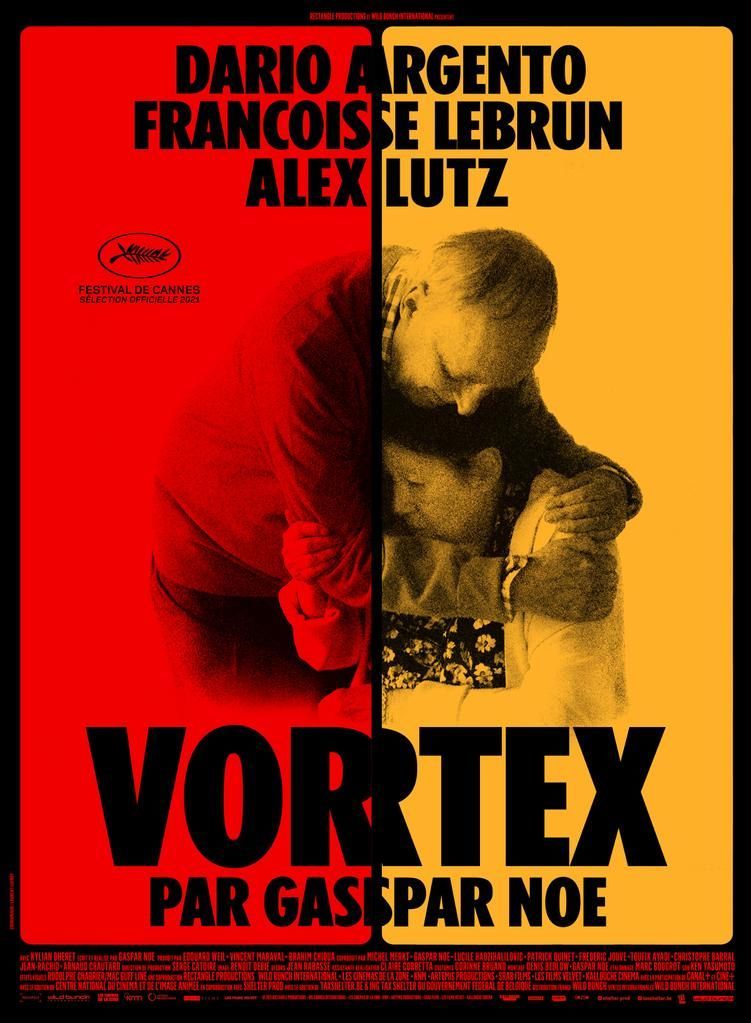
The twilight blueprint: Vortex (2021)
With Vortex, Noé shifts his tone. The poster adopts a much more understated approach: two faces, two gazes, separated by a vertical line reminiscent of the film's split-screen. The colors are muted, almost faded, like the crumbling memories of his characters. Far from the direct confrontation of his previous works, it stands out as an elegiac poster, reflecting a cinema that has become more intimate but remains experimental. (Click on the photo...)